Porpoises and fast hummers

freckle-blogpost-nov17.jpg

Getting your message across at sales conference time.

Yep, it’s coming round to that time of year again. The Annual Sales Conference. Like an end of year exam, it’s an entire year’s planning crammed into a half hour presentation. So don’t waste it! A great strategy communicated badly is like playing Chinese Whispers. Rather than ‘Focus on the needs of your customer’, you could end up with ‘Porpoise only feeds on your fast hummer’. And no one wants to see that.

Here are four things to keep in mind in preparing for your sales conference.

1. Be empathetic

It’s easy to get caught up in corporate tactics. How and why are the company doing this? Of more value is, why should our staff do this? What’s in it for them, professionally and personally. Like branding your company, a well considered and designed brand for your conference should establish an empathetic connection with your colleagues, motivating them to follow through on your strategy for the next 12 months.

2. Keep it short, clear and impactful

Ten minutes is as long as most people can hold their attention on any one thing (brainrules.net). So it’s important to keep them emotionally invested in your presentation. One way to do this is to use produced video to pull at their heart strings, or make them want to leap out of their chair with excitement. Punctuating presentations with an emotional trigger through video or imagery can spare your colleagues conference whiplash*. 

freckle-presentation-tips-144dpi.jpg

3. Use visuals rather than text

When people hear information, three days later they’ll only remember 10% of it. Add a relevant picture and they’ll remember 65% (brain rules.net).

Take the time to generate relevant visuals to reinforce your message. Remove all but the key words from your powerpoint slides - or remove them all together and just show a clear infographic or image.

4. Wash, repeat

Ever heard of a theory called ‘Spaced Repetition’? It’s about repeating things at increasing intervals to cement long-term memories. You can use it to remember peoples names, but you can also use it to cement your key messages in the minds of your colleagues. Use soundbites on gameday, then follow up with the same relevant, branded content to ‘repeat’ the message. Emails, leave-behinds, even merchandise, can drive your messages home long after the last after-party canapés have been devoured.


– / –

Now’s the time to get in touch if you’d like us to give your strategic messages a boost, with event theming, presentations, video production, sales collateral or promotional items.

* Jolting of the neck muscles due to sudden awakening from sleep during a presentation.

Nic's Picks

17/08/2021

Tatsuya Tanaka – Tokyo 2020

Tatsuya Tanaka is a Japanese miniature and mitate artist who explores everyday life scenarios. What makes his art so unique is his novel use of common household objects such as toilet paper rolls, cartons of eggs, fruit and veg, sugar cubes, the list goes on.

Everyday since 2011, Tatsuya has been adding to his ‘Miniature Calendar’ series by creating mini landscapes using these common objects, while photographing them and uploading the end results to his social media. He has gathered quite a following, with his Instagram account having a whopping 3.1 million followers.   

A more recent project is his piece “Tokyo 2020”, where he has recreated Olympic events using face masks and household items. Tanaka cleverly used medical face masks to represent different surfaces and equipment you’re likely to see at the Olympic Games. In one piece, he turns a blue mask into a swimming pool by lining up tiny swimmer figurines posed to look as though they’re about to dive in. What I love most about this artwork is his ability to take a challenging situation being experienced all over the world and convey it through art, hopefully bringing a smile to those who need it most.

221847103-208490977746022-9096366775004504139-n_f876.jpeg
 
28/01/2021
Image courtesy of Denomination

Image courtesy of Denomination

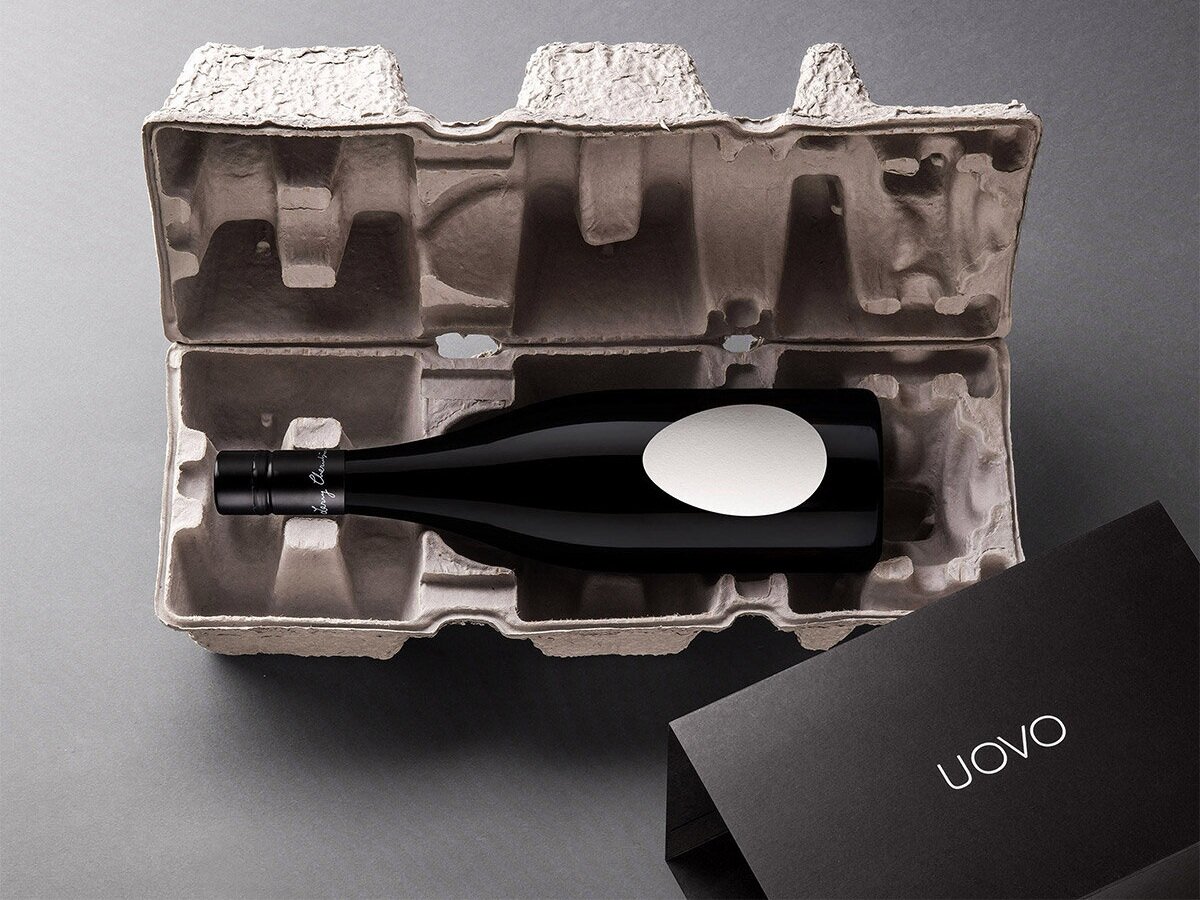
Denomination’s ‘Ouvo’ – Wine packaging that breaks every branding convention.

There is more to someone (or a wine bottle) than meets the eye. A wine label for some people (probably most), is just a pretty picture stuck on a bottle. But it can completely change people’s perception of the wine, even the taste! Denomination’s ‘Ouvo’ label breaks almost every branding convention, and that’s why I love it.

The simplicity of the label is astonishing. The creative team’s insight was born when three hulking ‘egg’ tanks were delivered to Larry Cherubino’s winery. The originality can be seen in the warm white egg-shelled textured paper, and the lack of graphics on the label perfectly represents the authentic winemaking process. To add to this, the shape alone and the egg carton packaging is like no other and a unique identifier.

Larry Cherubino said “consumers love the packaging, then they taste the wine, and it all ties together… the pack, the method, the wine. It’s so simple but effective” – This sums it up perfectly.

Image courtesy of Denomination

Image courtesy of Denomination

 
23/10/2020
Image courtesy of Frost*collective

Image courtesy of Frost*collective

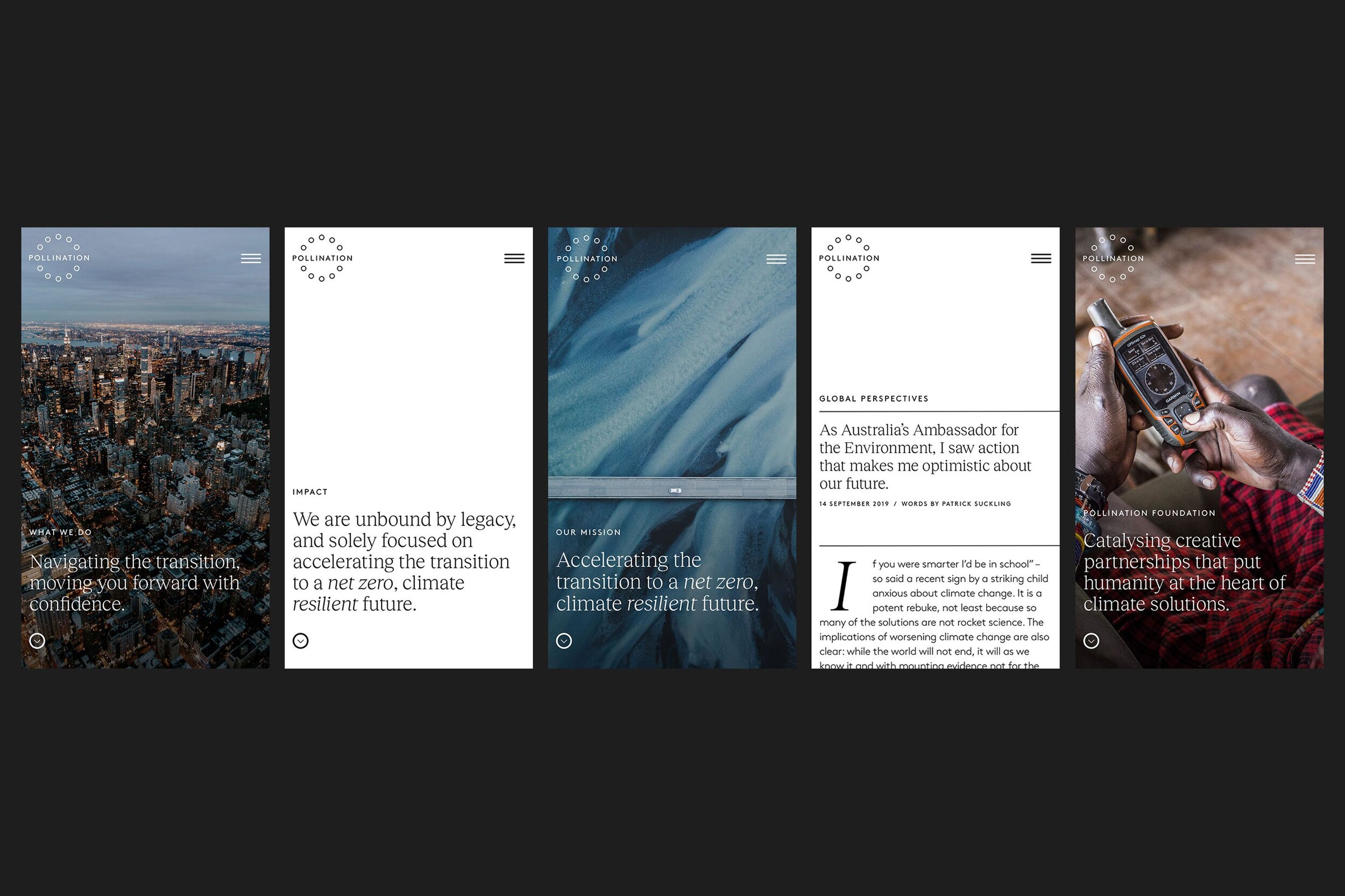
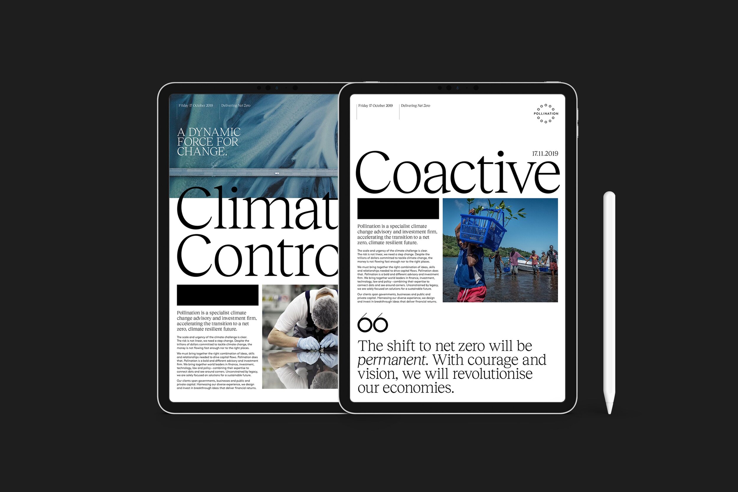
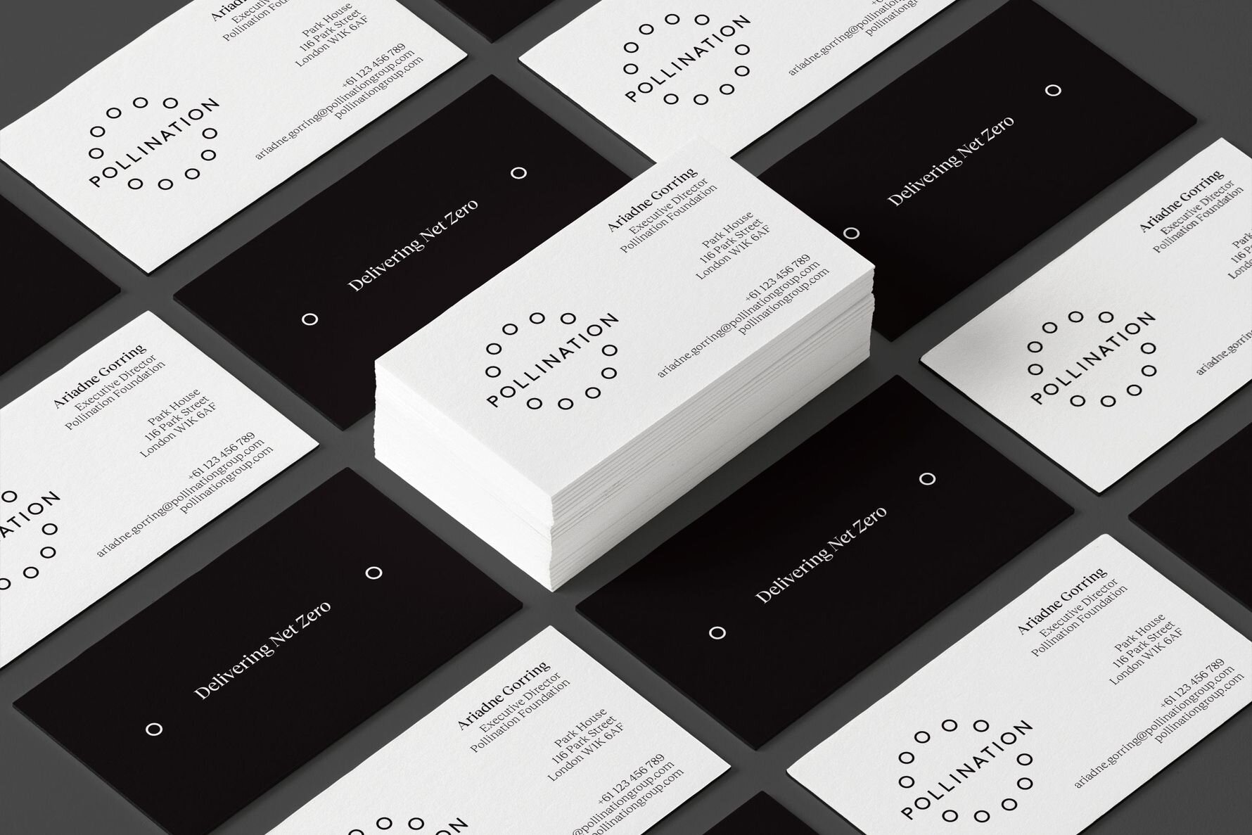
Frost Collective’s ‘Delivering Net Zero’. A brand launch
for Pollination (a global investment and advisory firm with a single purpose: accelerating the transition to a net zero, climate resilient future). 

Talking about climate change isn’t easy. Large business organisations and governments are aware that defying solutions are rapidly needed, but many choose to ignore it. The way forward can sometimes be unclear, Pollination are a global investment and advisory firm that have a purpose to accelerate the transition to a net zero, climate resilient future. What I enjoy most about this campaign is the meaning and drive behind it. Pollination are big-picture thinkers, driven to get the ball rolling. Frost Collective had a vision to launch an identity for Pollination, based on working collectively towards a net zero carbon emissions future.

Technically, the branding aims to drive the net zero campaign even further. The black and white colour palette highlights that climate change shouldn’t be a grey area. The circular, zero looking graphics within the logo are a nice way of conveying their mission. Photographic direction is something that can be easily overlooked when designing for a brand, although in this case it champions the role of Pollination which can be seen at the centre of the climate change story – to show the bigger picture.

Images courtesy of Frost*collective

 
28/09/2020

Image courtesy of Turner Duckworth

Turner Duckworth's 'Breaking the chain' - A creatively driven system to support EJI's (Equal Justice Initiative) message in a bold and exposed way.

Hey! I’m Nic, Freckle’s new(ish) junior graphic designer. I am creatively driven and a bit of a design geek. One aspect that fascinates me about design is the ability to combine creative talent to artistically problem-solve. This particular campaign is one I have recently drawn inspiration from.

Having had the privilege to meet Bruce Duckworth, I know he aims to design for purpose and that is what is so admirable. Due to recent events (Black Lives Matter movement), this campaign stood out for me in support of EJI. It highlights the challenging racial and economic injustice. The campaign acknowledges the protection of basic human rights for those who are most vulnerable in American society.

Technically, the artwork is strong and loud. The branding contains bold fonts, backed up with a powerful black and red colour pallet. The print collateral is simple, clean and importantly lets the message of EJI be told.

Image courtesy of Turner Duckworth

Image courtesy of Turner Duckworth

Strategically, this campaign is outstanding. The broken chain logo accompanied with slogans such as "justice for all” and “slavery didn’t end in 1865, it evolved”, I believe represents EJI's commitment to ending mass incarceration and excessive punishment in the United States. Turner Duckworth has created a powerful visual identity to support a humanitarian non-profit organisation.

Interview with a Freckle: Marni Jacobson

IMG_8864.jpg

What do you tell people at awkward speed dating events?

I make my own entertainment and talk to myself when people refuse to talk, I laugh at my own jokes a lot.

Where were you before Freckle, and why the change?

I was in the admin/production side of a boutique motion design company called MISTER; they do beautiful 3D design and advertising. Unfortunately a pandemic can change a lot of things, but they’re just around the corner from Freckle whenever we want to catch up.

What are your strengths and ‘quirknesses’?

Strength is my ability to organise anything, my quirkiness is my need for other people to follow my system. I even have a certain way you have to fold the bath towels.

Who aren’t you?

A picky eater

Where do you see yourself in 5 minutes? 5 days?

Honestly who knows – but most likely doing very similar things to what I was doing 5 days ago. I’m a creature of habit.

Are you a Mac or a PC? Dog or cat? Tea or coffee?

Mac / Cat / Tea. In saying all this, I wouldn’t pass up any 6 of these options.

What could Freckle clients ask you about, that you could expertly talk about
for an hour?

Why excel is the superior way to organise things, ancient Roman or Spartan history or how to bake anything without measurements.

What will your next ‘Freckfest’ talk be titled?

How to prepare for the end of society, as explained by someone who hates camping.

Interview with a Freckle: Nicolas Hrdina

IMG_5865.jpg

What do you tell people at awkward speed dating events?

I tell them I am an aspiring graphic designer who is creatively driven and passionate.
Or I’ll talk about food.

Where were you before Freckle, and why the change?

Before Freckle I had finished my second internship as a designer, and I was on the hunt for ‘the job’. Luckily Freckle came around right at the perfect time… maybe it was meant to be!

What are your strengths and ‘quirknesses’?

I pride myself on my ability to listen, visualise and solve problems with my own
creative flare. A quirkiness of mine is probably that I’m pretty handy at playing the flute.

What’s the fuel for your design engine?

I draw inspiration from my everyday life, but a driving factor has absolutely been my family. We are a family of seven and all of us are creative, my dad is an architect, my mum a ceramist, my sister an interior designer, my twin an architect, my brother a painter and my other brother a musician. After you’ve figured out how to draw my family tree you will realise I had no choice!

Where do you see yourself in 5 minutes? 5 days?

In 5 minutes, I hope to be jamming to my favourite song at the moment (The Adults Are Talking – The Strokes) on my way to get a coffee, hopefully in the sunshine. In 5 days, fingers crossed it’s Friday afternoon and I see myself signing off after another informative and productive week with the Freckle crew. If I’m lucky I’m off to a delish dinner somewhere where a Negroni will be waiting for me.

Who’s your design/creative hero?

Either Julian Meagher – a fine artist based in Sydney who paints beautiful abstract landscapes, or Bruce Duckworth – Co-Founder and Co-Chairman of Turner Duckworth, who has been a great mentor of mine.

What could Freckle clients ask you about, that you could expertly talk about
for an hour?

My mother would like me to say her and I think I would do pretty well at that but there’s a couple of other things I could nail too. Such as what it’s like to be a twin and the youngest of five, the Harry Potter movies or my favourite sports (tennis, surfing, rugby, golf).

What will your next ‘Freckfest’ talk be titled?

My next Freckfest talk would be titled "How to eat anything and everything".

Interview with a Freckle: Jacquie Synnott

Jacquie is the newest member of the Freckle team. Following her job interview and getting settled in, we thought we would sit down with her for an 'unterview', and get to know the person behind the CV.

Jacquie is the newest member of the Freckle team. Following her job interview and getting settled in, we thought we would sit down with her for an 'unterview', and get to know the person behind the CV.

What do you tell people you do at awkward speed networking events?

I manage the daily workflow between our designers and clients, ensuring all jobs are looked after and effectively run from start to finish. When I’m not doing this, I’m probably at home taking photos of my cat.

If you weren't at Freckle, where would you be?

Before Freckle I was working as a full time Graphic Designer at a large Australian architecture firm called Architectus; creating in-house visual communication pieces including HR campaigns and property marketing collateral.

During this time (and for some time before!), I wanted nothing more than to work in production management, at a small branding agency and focus on freelance graphic design projects in my spare time. When the opportunity at Freckle arose, I grabbed it!

What are your greatest strengths and ‘quirknesses’?

My strengths lie in the technical aspects of design. From creating technical drawings to technical spreadsheets… I enjoy the methodical process of design problem solving.

I also know my way around a table-top hand loom! All thanks to a bad flu and access to YouTube just over 3 years ago, I’m now a proficient hand weaver. I guess you could call this my greatest ‘quirkness’!

Who aren't you?

Out of all the things in life that I am not, I would have to say I am not the type of person who confuses purple for blue.

Where do you see yourself in 5 minutes?

Replying to 3 emails at the same time, whilst dreaming of dumplings for dinner.

... 5 days?

Planning a trip to South East Asia to make the dumplings a reality!

Are you a Mac or a PC? Dog or cat? Tea or coffee?

I am a cat sipping on a takeaway coffee in front of a MacBook, and I know many people who can vouch for this.

What could Freckle clients ask you about, that you could expertly talk about for three hours?

Around two years ago I worked at a creative production design studio in London specializing in the design and installation of retail window displays and pop-up shops. This is during the time when my love for production design blossomed. If a Freckle client was to ask me about the creative production involved in an event or retail space, spanning from signage to installation manuals to props, I would be able to chew their ear off on the topic! Firing off questions such as “Is it legible? Is that at eye level? Is it adjustable??” so on and so forth…

What will your ‘Freckfest’ talk be titled?

With all the construction and general development happening in Sydney as of late, I’ve become extremely interested in urban design within big cities. I think I would base my Freckfest talk on a great book I’m reading called Happy City by Charles Montgomery. This isn’t set in stone though; you’ll have to wait to find out!